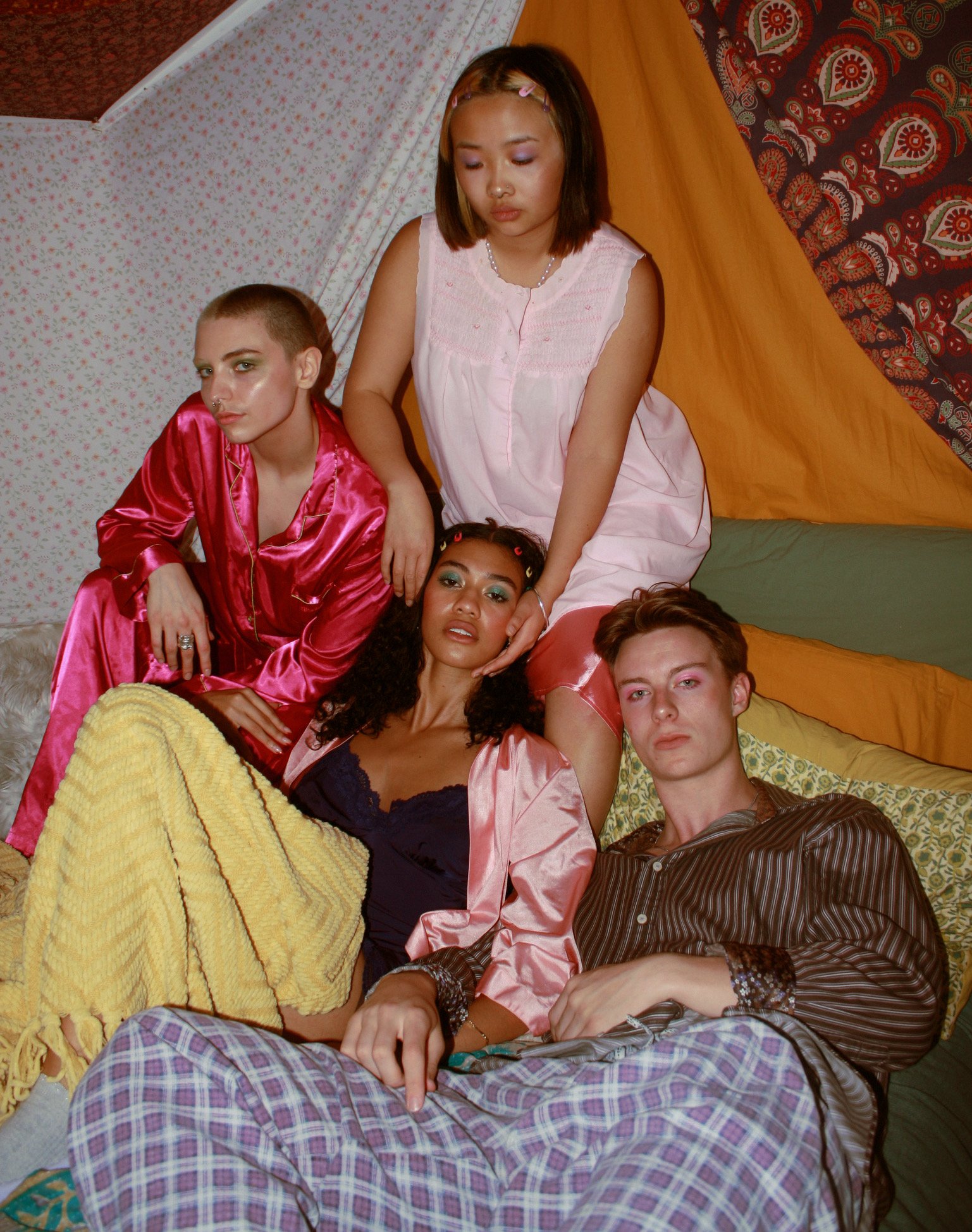
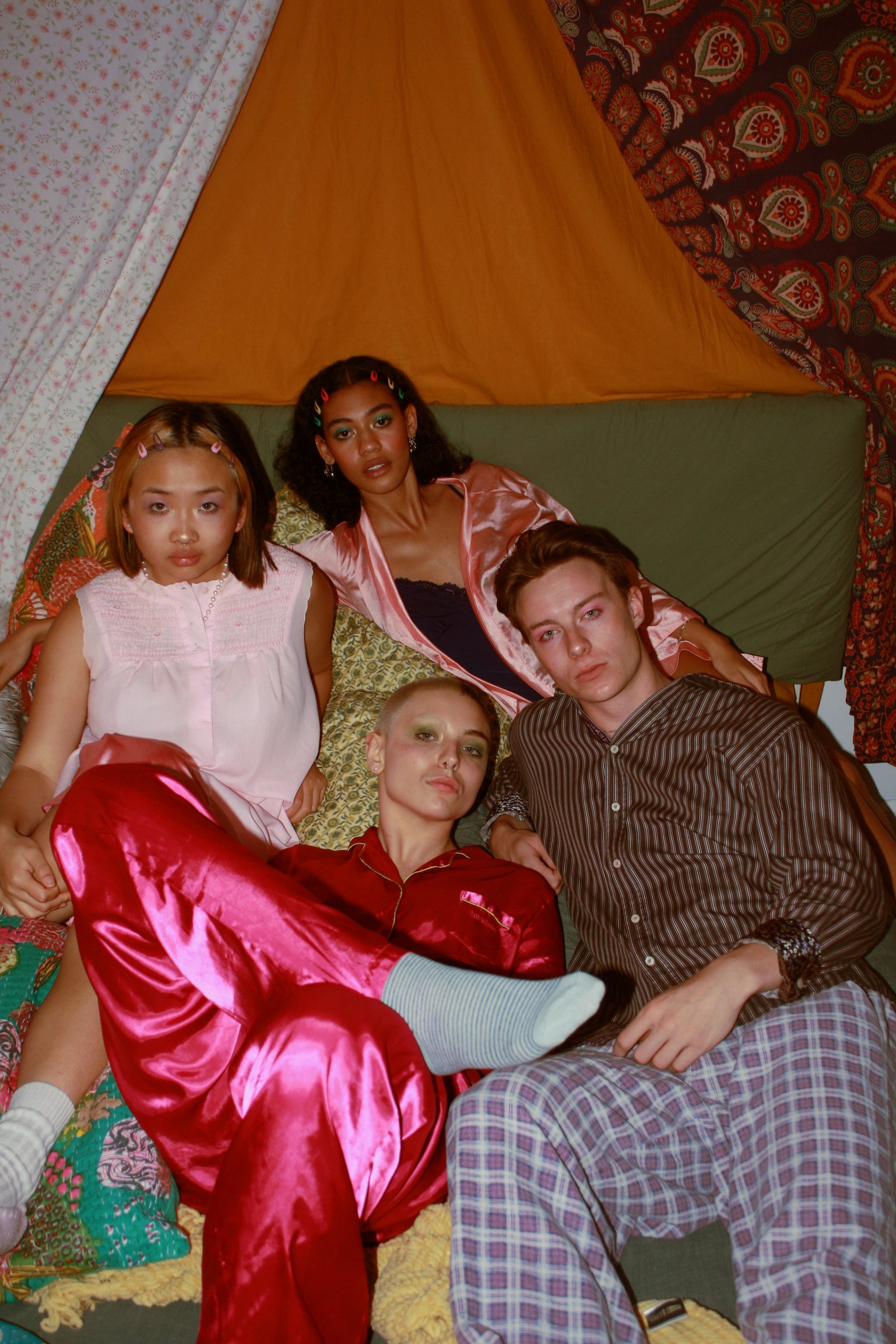
Behind the Pages: A Look Into Creative
When imagining the realm of student publications, images of black and white and greyscale papers covering local events may come to memory. More often than not, people think that student-created work resembles the professional world of print media.
It is for that reason that MUSE differs from your typical publication. While MUSE XXV is full of passionate written work, it also features seven editorials that are the love projects of the creative minds on the MUSE team. These editorials fill our magazine with colour, life, and larger themes, including intimacy, connection, and our existence as young individuals. When asked to explain how the creative process has transformed this year, Creative Director Rida Chaudry emphasizes the pressure that the team put on themselves to produce their best work. “We wanted to challenge ourselves by taking MUSE to the next step.” This creative endeavour, to take themes and design tactics that have never been explored in the magazine, proved all worthwhile in this issue.
One of the many ways that Rida and her team pushed the boundaries of what MUSE is capable of creatively was through the exploration of graphic design.“We were really inspired by the work of the team last year where they experimented with layout and the photoshopping to elevate shoots in post-production,” Rida explains. As a result, all the editorial shoots this year feature some sort of graphic design element, allowing the images to intrigue the reader as they spot the multiple layers and hidden details. Inspired by the “Juliet has a Gun” shoot by Martha Hillen, Creative Assistant at MUSE in 2021/2022, the creative team sought to create bright, eccentric, and multi-dimensional pieces to commemorate this special 25th issue.
“When we hire our Creative Assistants and our Layout Designers, we think about the ideas they pitch to us in interviews and how those will look in the magazine and translate to the MUSE identity”
Aside from the newfound commitment to expanding what we define as a MUSE editorial, the ideas for this issue began during the hiring process. “When we hire our Creative Assistants and our Layout Designers, we think about the ideas they pitch to us in interviews and how those will look in the magazine and translate to the MUSE identity.” Last spring, over 25 individuals applied to the position of Creative Assistant, and Rida and MUSE’s Head of Editorials, Indira Fisher, narrowed the team down to five talents who they knew would have the greatest impact on the creative vision of this year’s issues. This same process was enacted for the layout, photographer, videographer, makeup and hair, and intern team—it is incredibly obvious that there is an immense amount of thought given to who makes up this group and how their creativity will manifest in the issue.
After the Creative team is fully hired, they pitch their ideas for what their shoot will look like. During this time, Rida ensures that the Creative Assistants are given as much freedom as possible. These are, of course, “their design babies,” and the team works hard to support their vision and make their editorial dreams come to fruition. Each shoot involves the direction of the assistant, the coordination of models, and the efforts of hair and makeup, photographers, and videographers. Overall, Rida notes that while there have been obstacles, as a majority of the creative team are new to their positions and are working through a learning curve, the way that their ideas have translated into the Print issue is astonishing.
The shoots this year are individualistic—there is not one thread that ties them together. However, the layout team worked hard at making the visuals for the articles and the editorials cohesive, creating a seamless flow throughout the issue despite the presence of differential editorials, each so unique in nature and concept. Rida shouts out the coheads of layout, Armita and Nadisha Gautam, for taking extra care of ensuring this cohesion; “Nothing seems out of place in the magazine—it feels like one complete issue, and everything from font style to colour coordination was carefully picked out to achieve flow.” The team stayed up until sunrise putting together the final layout touches.
Yet this cohesion throughout the issue does not dilute the vibrance of each shoot, all of which are completed with the highest level of professionalism while maintaining the distinct level of creativity and eccentricity that is at the roots of the MUSE brand. “From edgy shoots to dreamy, to intrinsically artistic, the editorials all go in different directions in the emotions they give off,” Rida explains, and in a little over a week, you’ll be able to see just what she is referring to. All seven of the editorials are inherently different, but if Rida had to define them in one term, she would say they are, “innovative.” Whether they are broody, reflective of scenes relevant to Queen’s student life, or vibrant and funky, the shoots wholeheartedly express the creative minds behind this year’s issue. The love, passion, and dedication to emoting through visuals is something that not many are capable of doing—but the MUSE Creative team does it, and does it well with Issue XXV.
Here are some words straight from some of the creative team about their experience with Issue XXV.
What are three words you associate with your editorial shoot?
Indira Fisher, Head of Editorials
“Dreamy. Surreal. Eclectic.
Jude Al-Samman, Creative Assistant
“Painty. Crafty. Fun”
Maeva Baldassarra, Creative Assistant
“Vibrance. Pride. Intimacy.”
Midhat Mujaddid, Creative Assistant
“Bound. Fear. Honesty”
Lily Grigoriadis, Creative Assistant
“Powerful. Alluring. Dynamic”
What surprised you about the Creative Direction process?
Midhat Mujaddid, Creative Assistant
“That most of the inspiration I got for my shoot didn’t come from looking at photos on Pinterest or other visual prompts like I thought it would, which surprised me, especially since editorial shoots are a very visual display of creativity. Instead, I found myself trying to interpret the invisible and intangible into a photograph-able arrangement.”
Jude Al-Samman, Creative Assistant
“The amount of time it takes to filter photos!”
Lily Grigoriadis, Creative Assistant
“I was, pleasantly surprised by the level of professionalism everyone brought to the process. I knew MUSE had an insanely talented team but I was so grateful to work with such a wonderful team. From the photographer, Olivia Wright, who is so insanely talented, to models, make up artist and videographer, everyone was a big part in creating a beautiful final product.”
Maeva Baldassarra, Creative Assistant
“A good donut spread and Harry Styles music can get people very excited to tackle a project!”
We cannot wait for you all to see these fantastic shoots in Issue XXV!
Header Credits
“Sweet Daydreams”
Creative Director: Maeva Baldassarra
Photographer: Olivia Smith
Videographer: Abby Boyd
Makeup Artist: Jill Ford
Models: Una Niu, Owen Ritsch, Irelande Ferrell, Destiny Campbell


